It seems a like a long time since I have updated my research blog, the reason being my project had now entered the final phase of the creative process. Starting in mid-October, I began to collate all of the work created over the last seven months into a printed book.
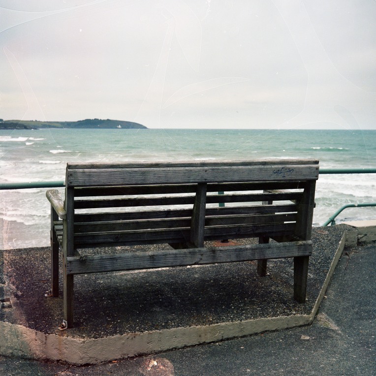
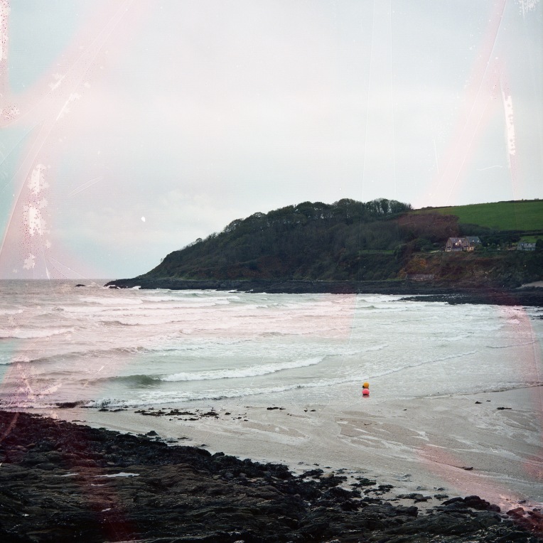
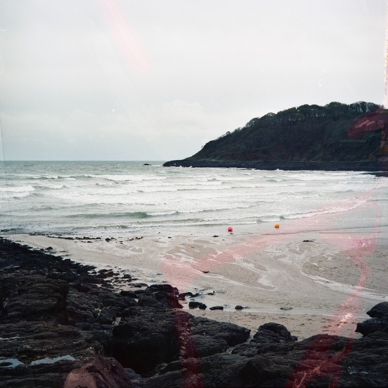
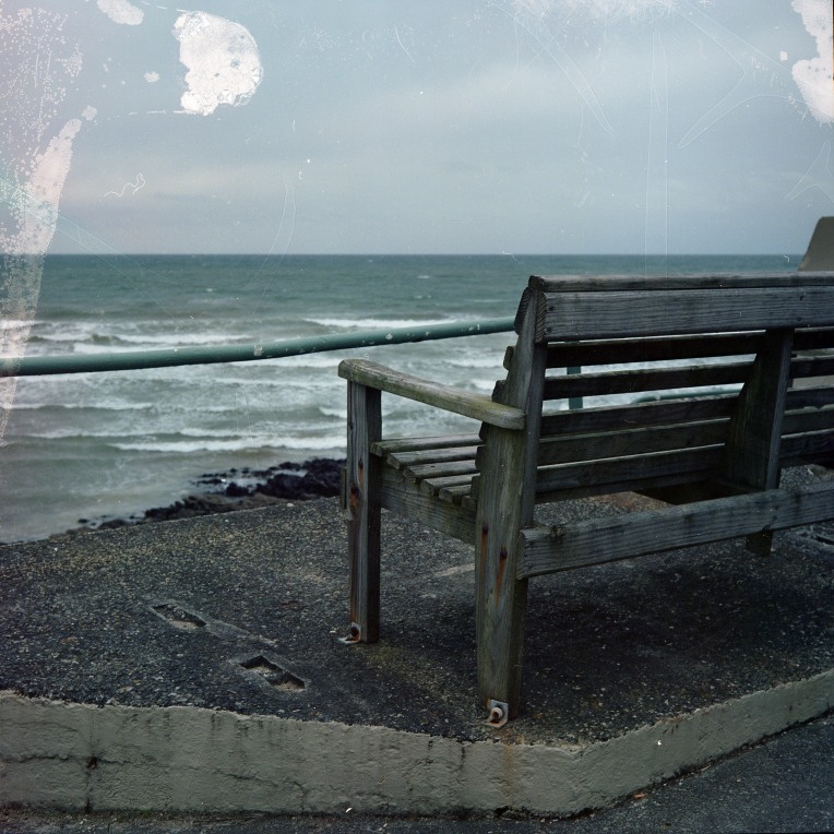
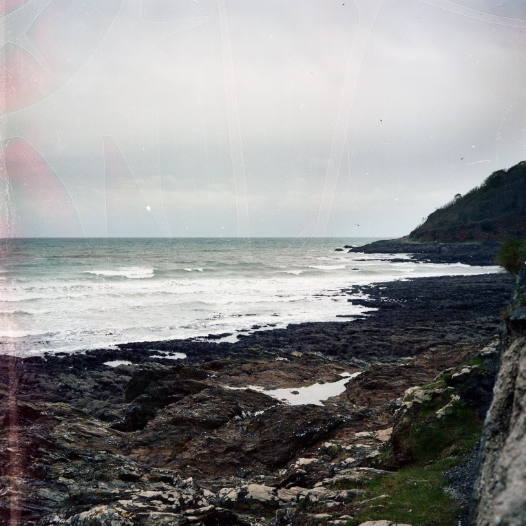
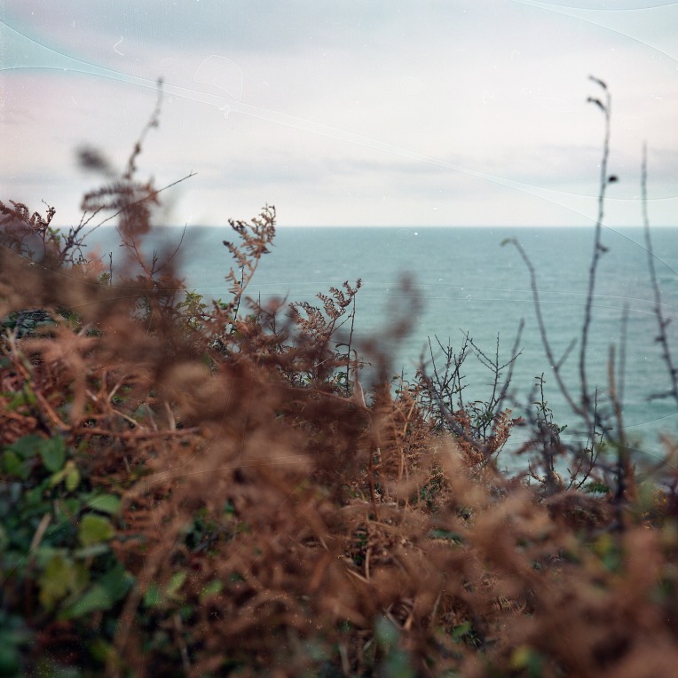
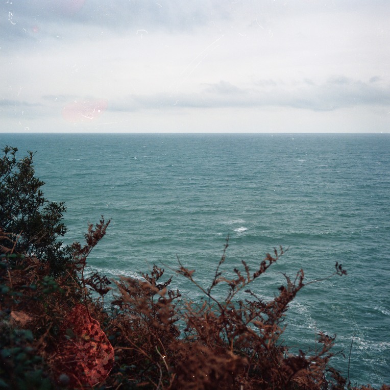
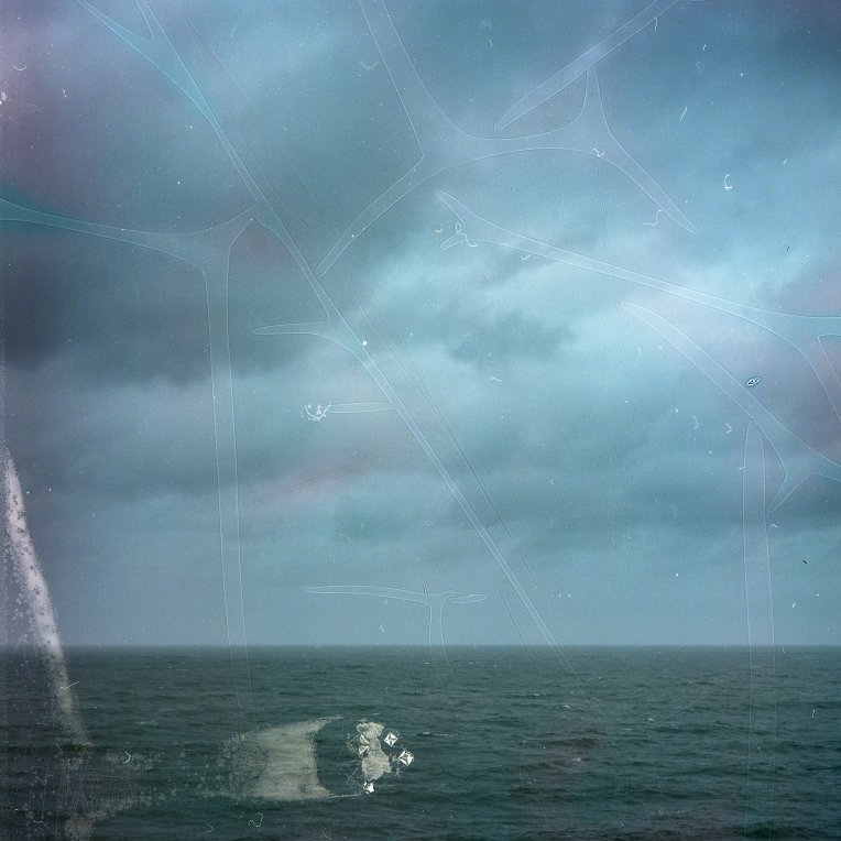
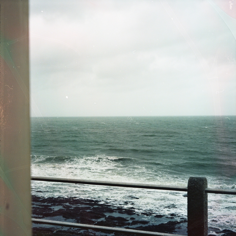
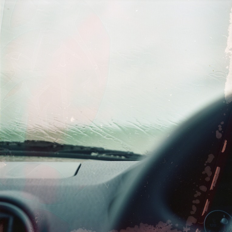
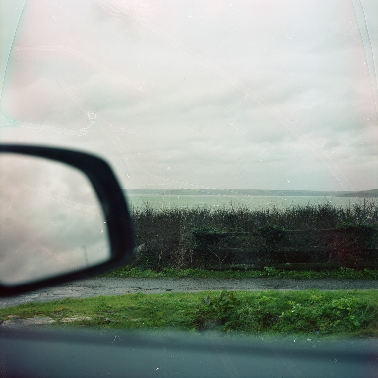
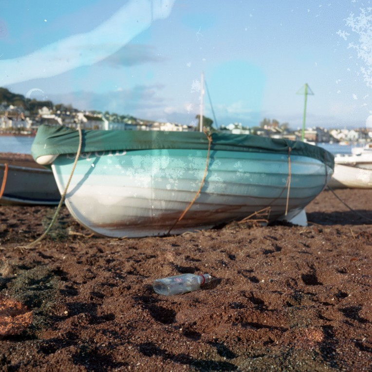
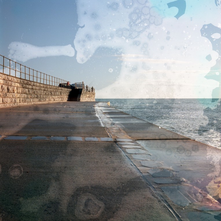
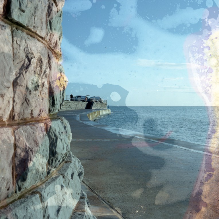
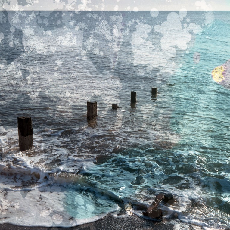
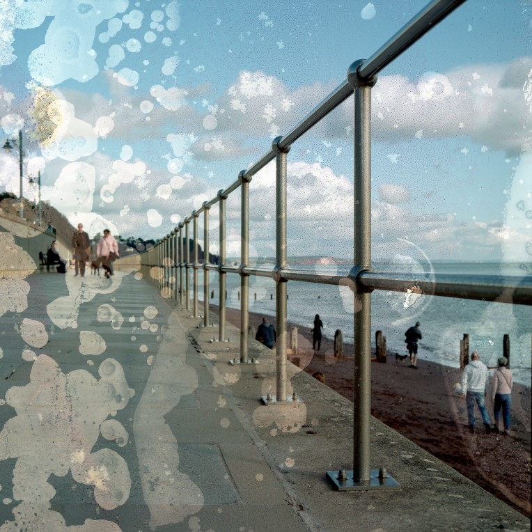
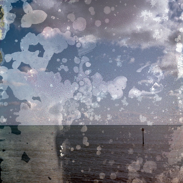
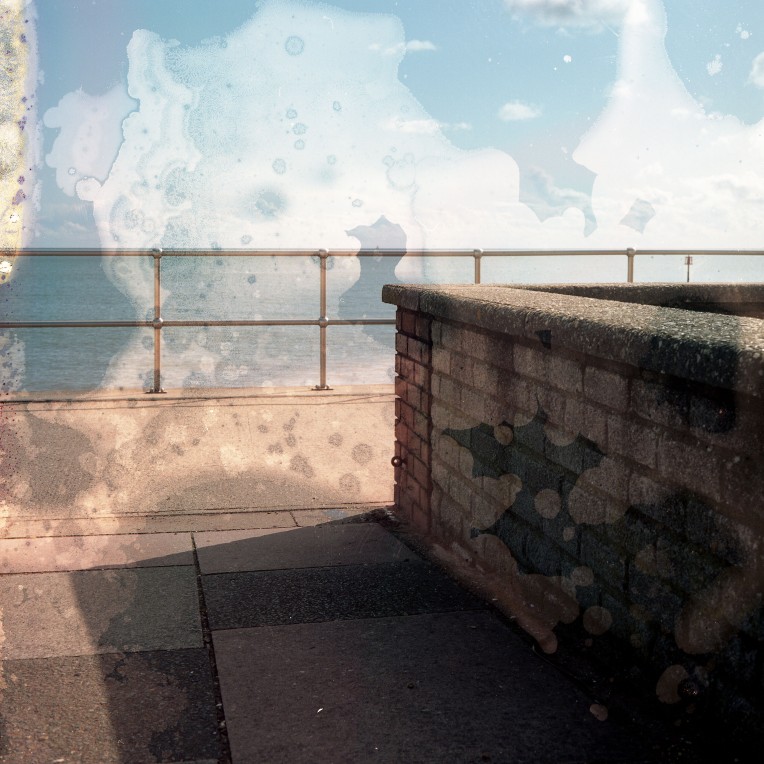
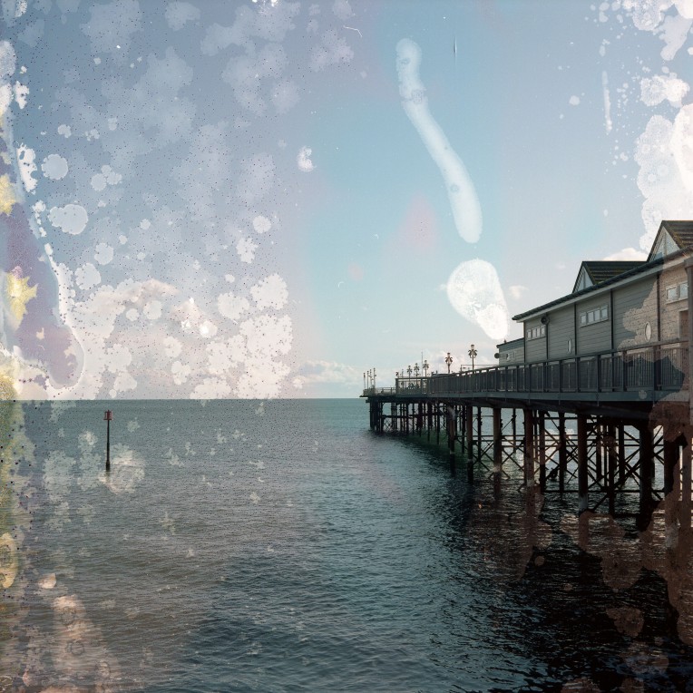
The first decision made was that the book should mirror the diaristic nature that the project had developed into and that the written responses I had recorded while capturing the images should be incorporated into the final design. With this in mind, the images were split into six chapters, each of them containing images and text from particular geographic shoots. The chapters created were irregularly sized as the duration of the shoots ranged from a few hours to several days at a time.

Selecting the final images was a long-winded process with lots of indecision and many changes. The sequence of the book is roughly chronological to the order of which it was shot with a little artistic license exercised to allow the flow to make a little more sense to the viewer. Various mock-up incarnations were made which included a dramatic culling of images to refine the order of the finished book. The texts I had written in my notebook became increasingly important as the project developed and as my research widened, and so the inclusion of a re-written and edited texts became essential to the project.
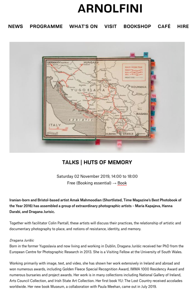
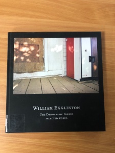
Having finalized the image sequence of my book, I started to research further the graphic aesthetics of book design. I had been influenced heavily by the Dragana Jurisic publication, YU: The Lost Country at an earlier point in my project by both the concept of the book and images, and by the book design itself, so this was a good starting point. Adding to this I also revisited other favourite photobooks for design inspiration including John Gossage’s The Pond and William Eggleston’s The Democratic Forest. I concluded that I wanted to create a large format cloth bound book with an image inlayed into the cover and title text debossed into the cloth.
Debossed text stamped into the cover and image inlay on the William Eggleston book


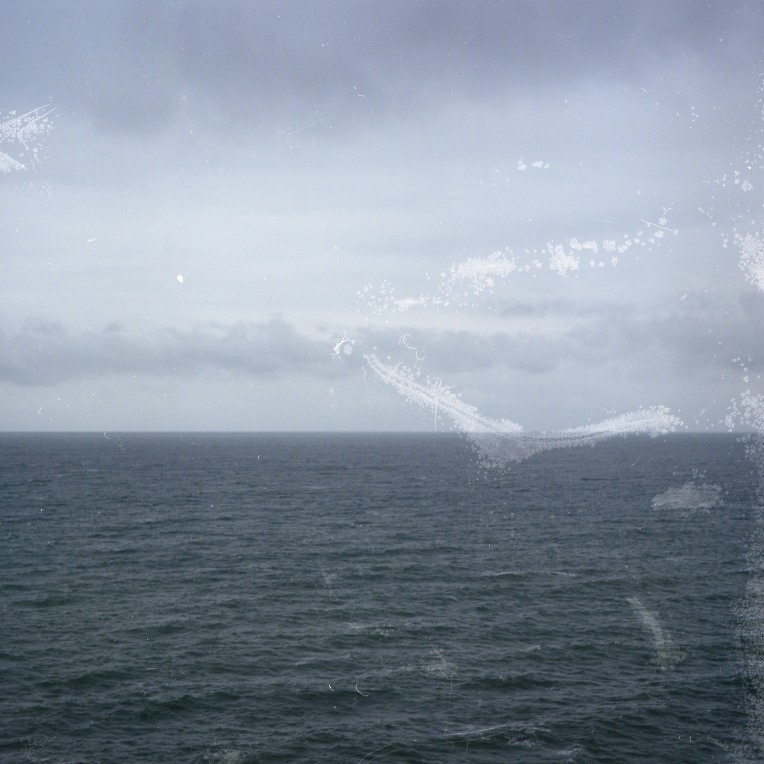
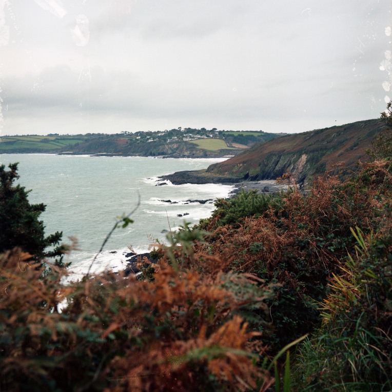
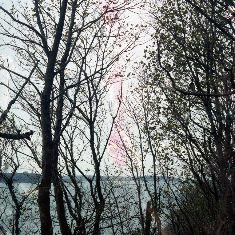
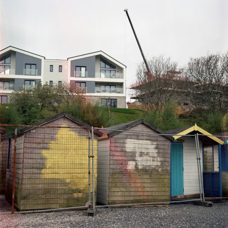
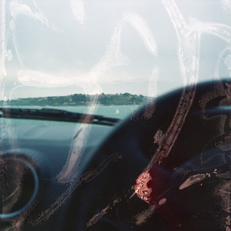
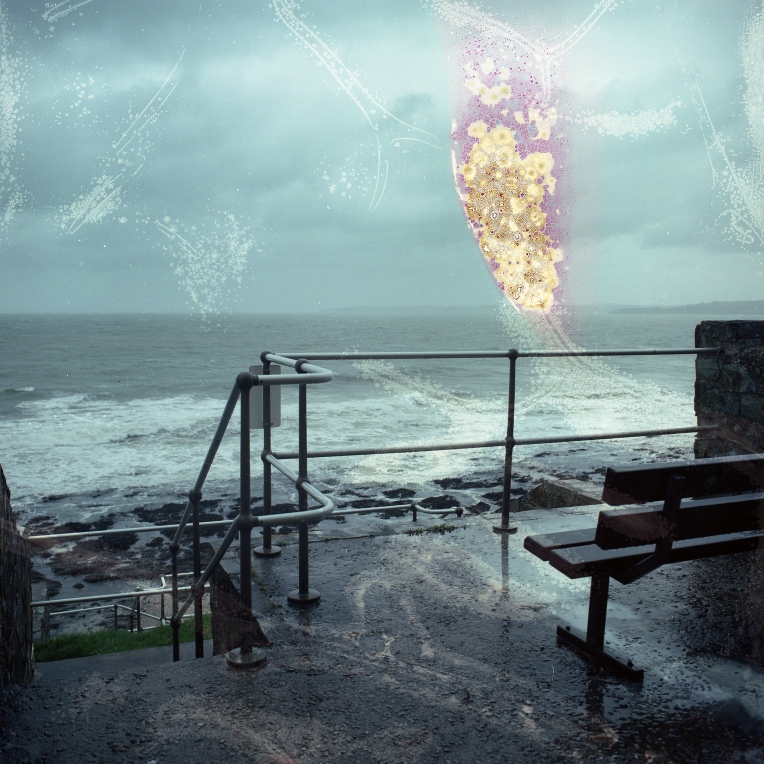
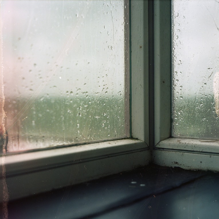
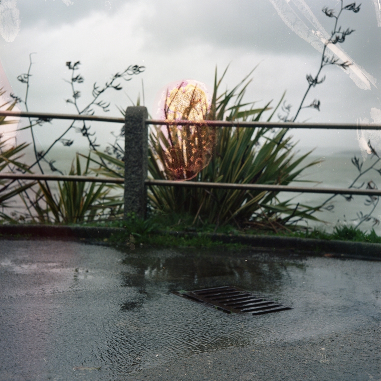
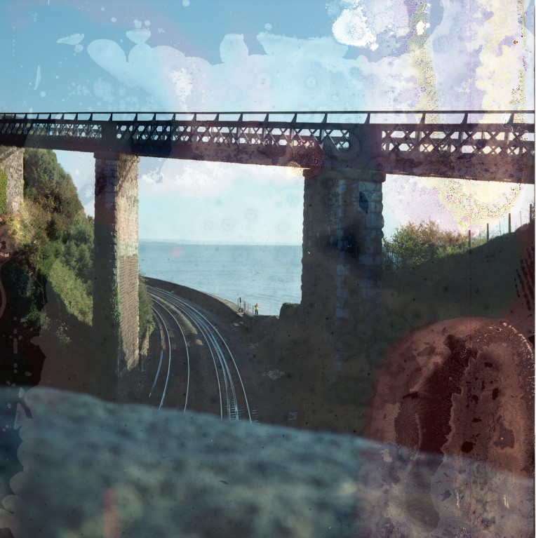
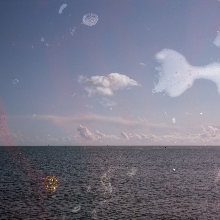
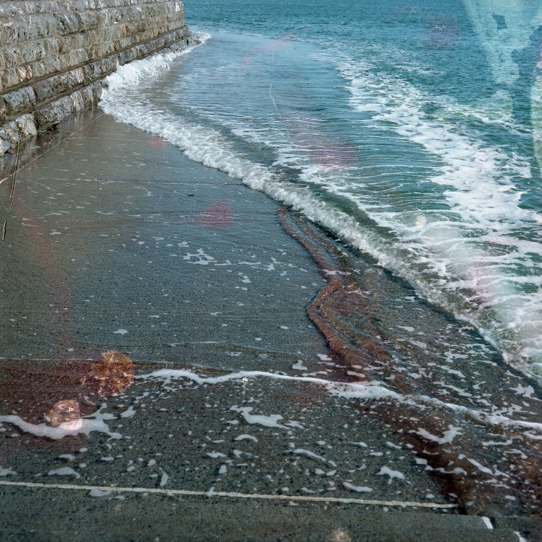
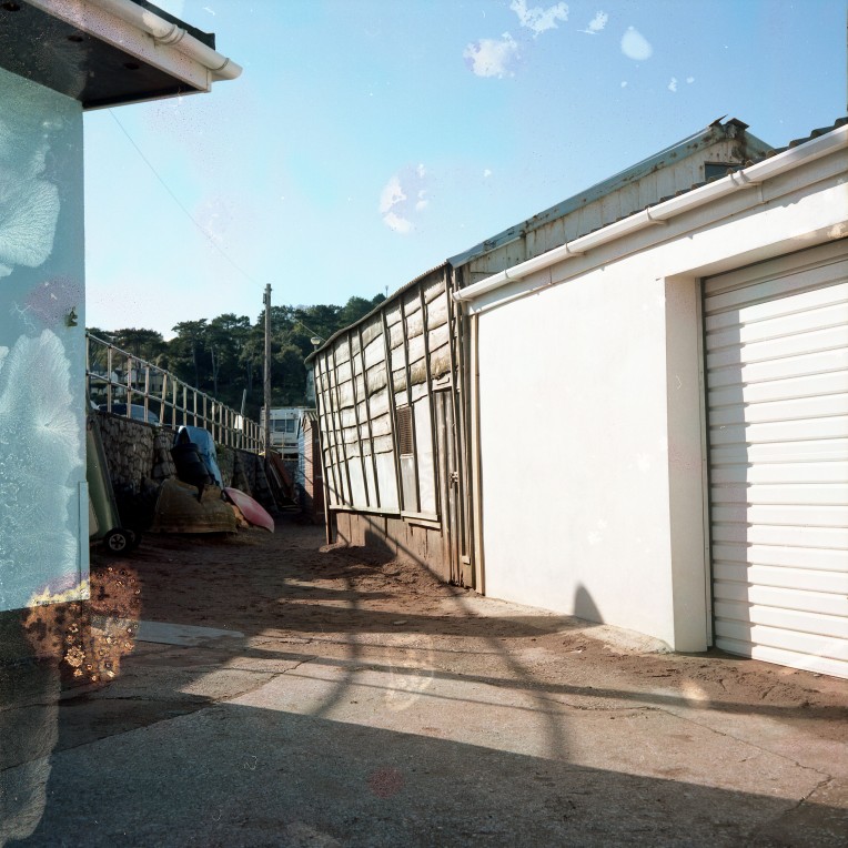
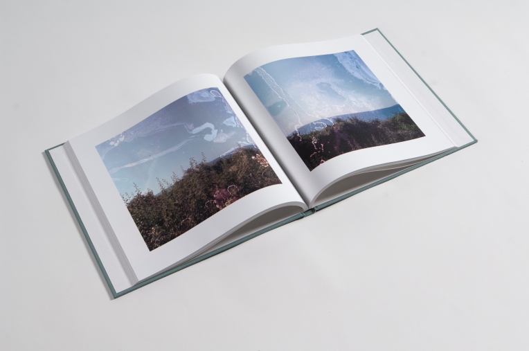
As all of the final images were shot on 6×6 medium format film, the book should be square to allow maximum image sizes. When examining the Jurisic publication, I liked the arrangement of the images ranging from full bleed through to white bordered pages. I also drew inspiration from the placement of the text intermingled with images which was an idea I felt suited to my own work too.
Editing the text I had recorded during the shoots was an especially difficult process. Certain images had text that directly related to them, while other notes I had written formed a more general overview of my responses at revisiting the sites of memories. My research had led me away from a ridged format of book design and so the design process of placing text with key images seemed suitable while other images have none. The final book has a text introduction, an overview accompanying each separate chapter, text annotations linked to key images and an epilogue. Altogether the text within the book runs to 3500 words which is far more than I expected it to be.
With the sequence of images and placement of text arranged, the next task was the selection of font choices and the inclusion of page furniture. I researched font choice briefly, but ultimately informed by the advice of a graphic designer. The nature of the text is my own voice, yet I was reluctant to quote myself as such. Therefore the humanist font family of Univers was selected for use throughout the book.
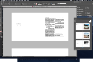
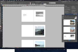
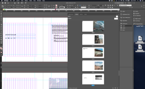
The design process in InDesign
With the book pages and cover created in InDesign, the final part of the journey was actually producing the book. Previously I have used the Blurb website to create printed books but this would mean too many compromises. Blub offer only two options of fabric for covers and are unable to emboss or print onto it. I needed to source a company that could make the book exactly as I had envisioned it.
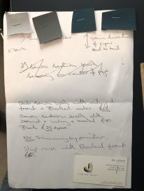
I researched various bookbinders with details about my project and build up a relationship with Bristol Bound Binders who were able to offer me a wealth of advice. Bristol Bound showed me a range of artists books they had previously created and I knew that the work they could produce was far beyond that Blurb were able to offer. They were able to manufacture the book by hand, but they could print the pages. A second company, Jam Jar Print, agreed to print the pages and I was able to choose from various papers for the job. After studying a range of printed samples, I select Mohawk Superfine Smooth 148 GSM paper which rendered the images well on a matt surface. It seems Mohawk paper is just about as expensive as paper can possibly be.
Explaining my project, the concept and the images, Bristol Bound were then able to produce a custom-made book exactly as I had imagined it. We discussed the various fabric choices available before selecting a grey-green that complemented the tones of the seascape image that was to be mounted on the cover. Supplying them with a PDF file of my cover text, Bristol Bound made a metal printing plate for the debossed cover and suggested a slightly faint white colour that echoes the concept of the project. Additionally, Bristol Bound manufactured a matching slip case box for the book also debossed and in the same cover cloth. The book looks superb and I am exceptionally happy with the finished outcome.
The finished book and slip case


References
Eggleston, W., 2016. William Eggleston: The Democratic Forest – Selected Works. Steidl.
Badger, G., 2010. John Gossage: The Pond. Aperture.